Kaldi
Kaldi · 2024 · Finance & Commodity Trading · via Flipside Group
- RoleBrand & Product Designer
- OutcomeWon the pitch; raised a $513K seed round
Brand identity, app concept and investor pitch deck for Kaldi, a Gen-Z fintech that invests your spare change, which went on to raise a $513K seed round.
Introduction
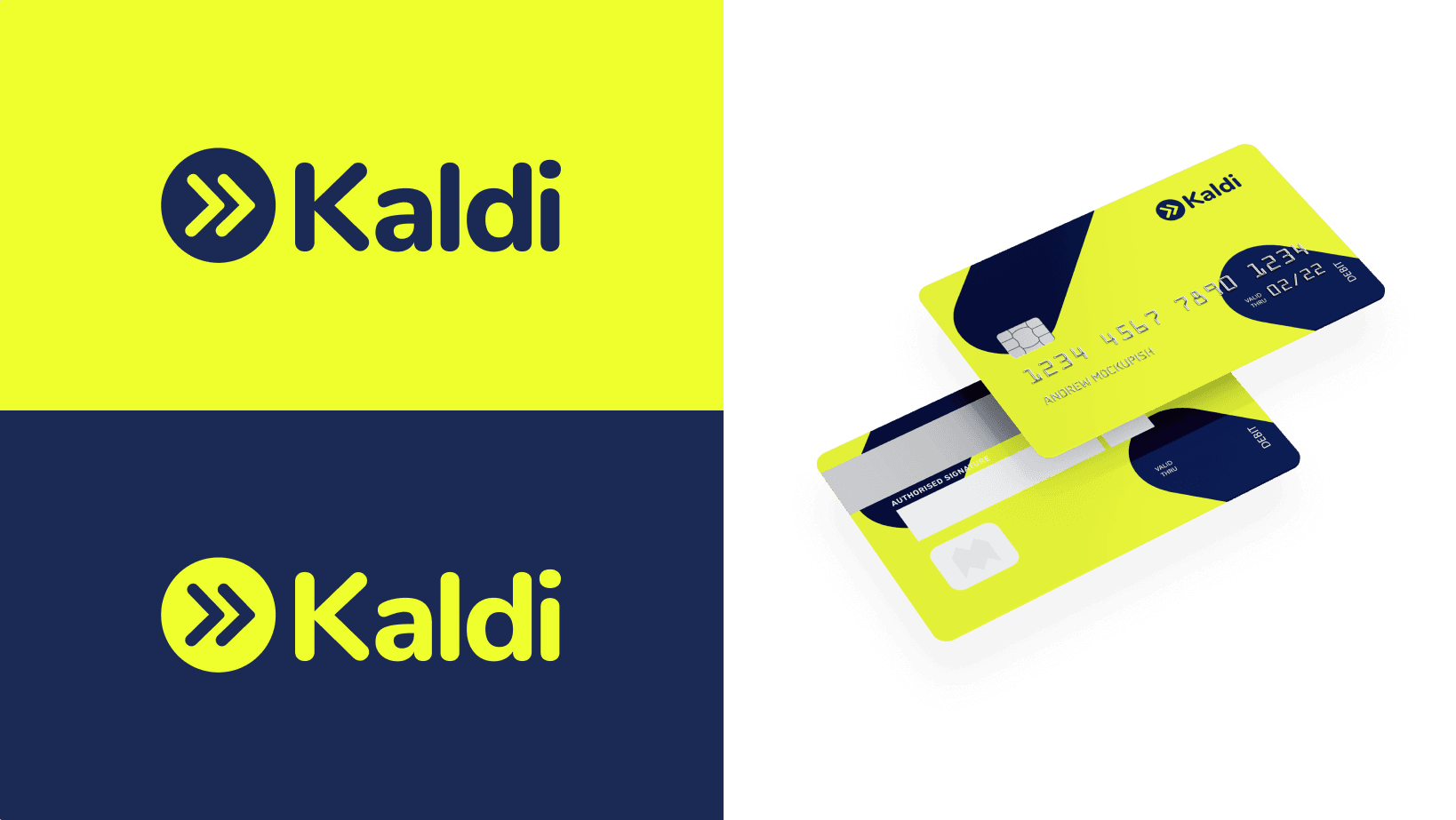
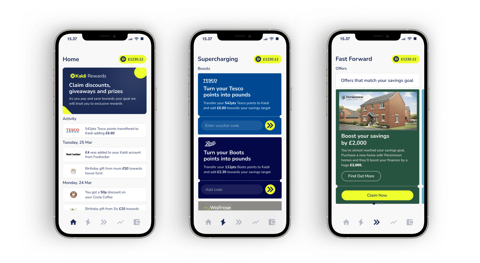
Kaldi was a branding and pitch project for a small company building an app but wanting to secure investment first. The founders were experienced entrepreneurs who’d had real success before, and my job was to design a brand and iconography that could sit side by side with established financial companies as part of the pitch. The product itself rounds up the spare change on a purchase and invests it into a stock, so the brand had to make that idea feel credible, modern and genuinely different in a crowded financial sector.
Design a brand and iconography that could stand beside established financial companies in the investment pitch (credible and modern, yet distinctive) plus a strapline and a visual motif that made “round up your spare change and invest it” land with a young audience.
Challenges overcome
The core challenge was creating an identity for a brand-new company entering sectors that are already busy and visually fairly conservative. It had to look professional enough to sit next to established financial brands while still feeling new and distinctive rather than blending in. To do that well I had to turn a broad proposition into something with clear edges I could design against: a defined audience, personality and reason for being.
Strategic thinking & planning
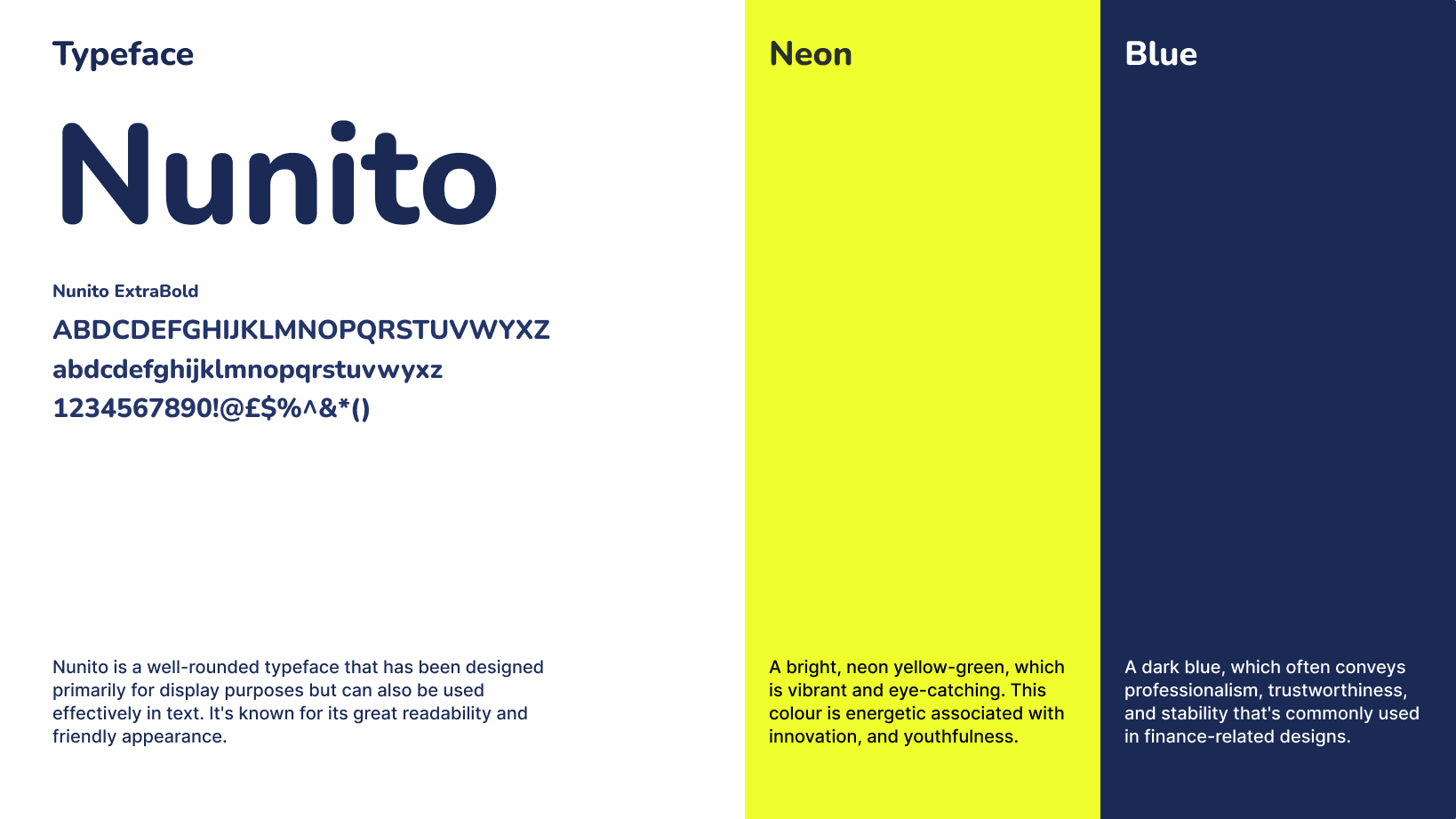
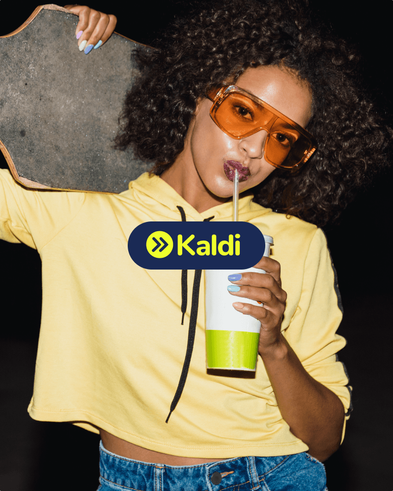
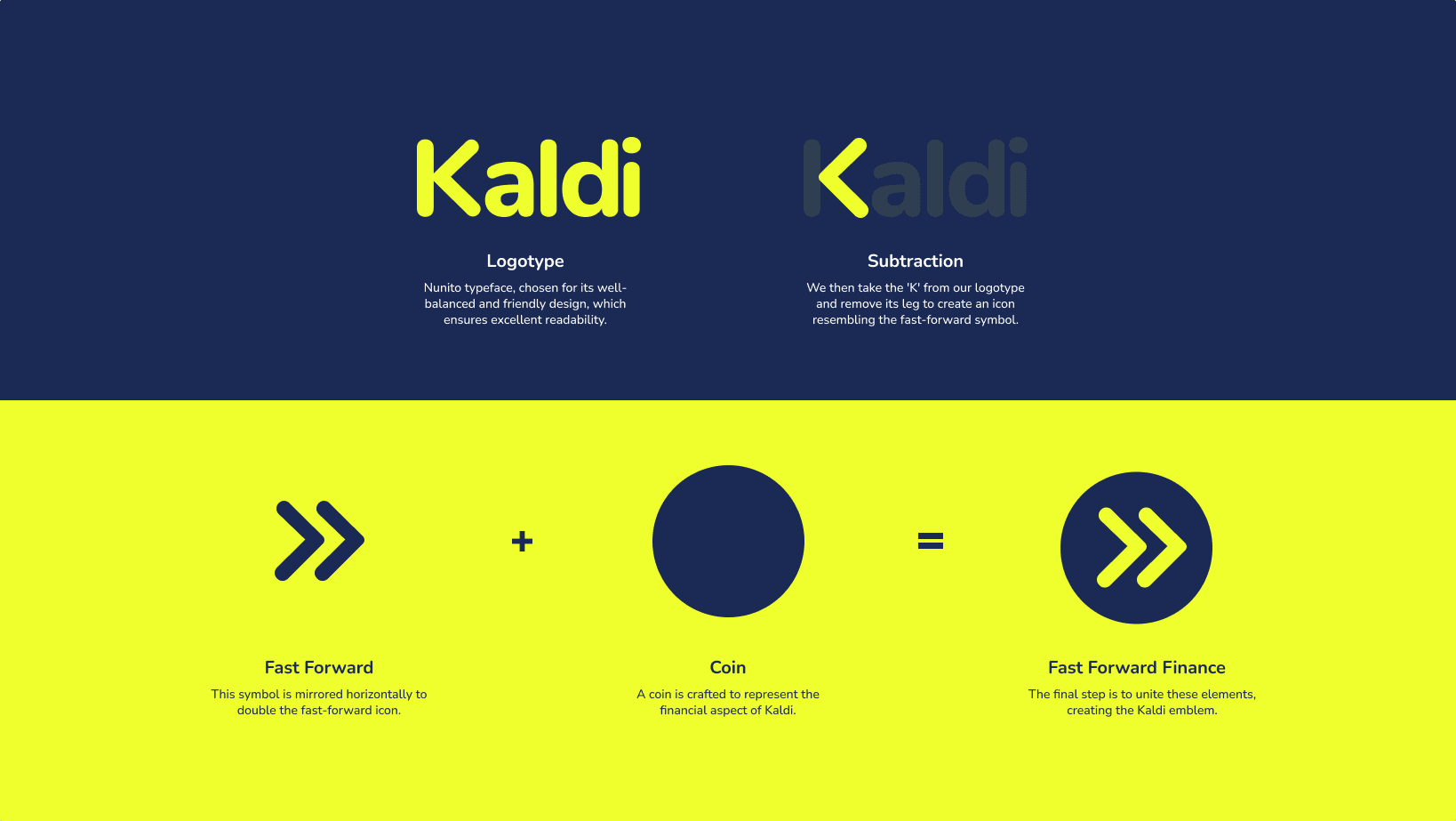
I framed the brief with a questionnaire so I had firm boundaries once the founders answered: who it’s for, the ideal customer, the personality, the “why”, the USP. Then I studied the marketplace, pulling six or more brands across each relevant sector (loyalty, coupons, money-saving, trading, payment alternatives) and breaking down their colourways and typefaces. I even set the word “Kaldi” in other brands’ fonts to gauge what felt professional yet new. I explored straplines the Q&A pointed to: More than loyalty, Beyond saving, Spend, invest, grow, Supercharged spending, and sketched an ad layer to make it tangible (“buy a hamburger today, a home tomorrow”). The founders gravitated to the “supercharge” territory, and as I built logo motifs I landed on fast-forward finance: the mark reads like a fast-forward button, since arrows already signal progress across the web, so it naturally invites the tap beside a checkout. I chose Nunito (friendly and rounded, rather than the harder lines most money brands lean on) and paired the logo with three colourways: a serious blue, a vibrant orange and a vibrant yellow, then mocked it up in-app and against the target demographic.
Outcomes
They won the pitch, going on to raise a $513K seed round. Once they had, the brand moved into a further phase with another designer, as I’d moved on to the next project, as tends to happen with branding. What I produced was clean, clear and consistent, and I believe it left the brand in a really good place; they’ve since taken it in a more “rainbow” direction, so I’ll leave my assessment at the point I handed it over.


 View this project in the interactive portfolio →