Caledonian Sleeper
Caledonian Sleeper · 2023 · Education & Transport · via Flipside Group
- RoleLead UX/UI Designer
- ImpactCut call-centre load with a proactive help section
- OutcomeRebuilt booking funnel and booking widget
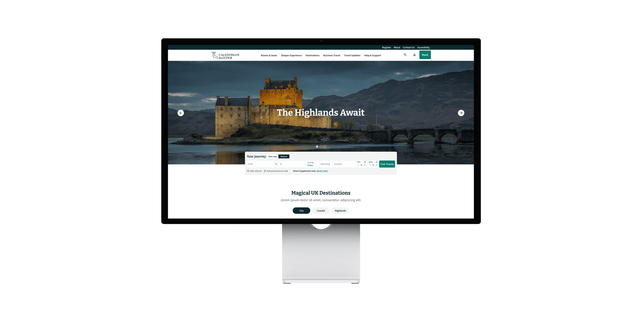
A redesign of the website for Caledonian Sleeper, the iconic UK overnight rail service, pairing modern, responsive usability with the elegance and heritage of the brand.
Introduction
The Caledonian Sleeper is the iconic overnight rail service between London and the Scottish Highlands. This was a complete redesign on a very short turnaround (designs configured and delivered in a tight window before build) and everything had to fit around the existing booking engine and booking system. The previous site had grown tired, its UX buckling under the weight of new content.
Lighten the whole look and feel, make it modern, and design something that would stand the test of time, while making people genuinely excited to head back to the Highlands. Much of the design leans into featuring the destinations and building anticipation for the journey.
Challenges overcome
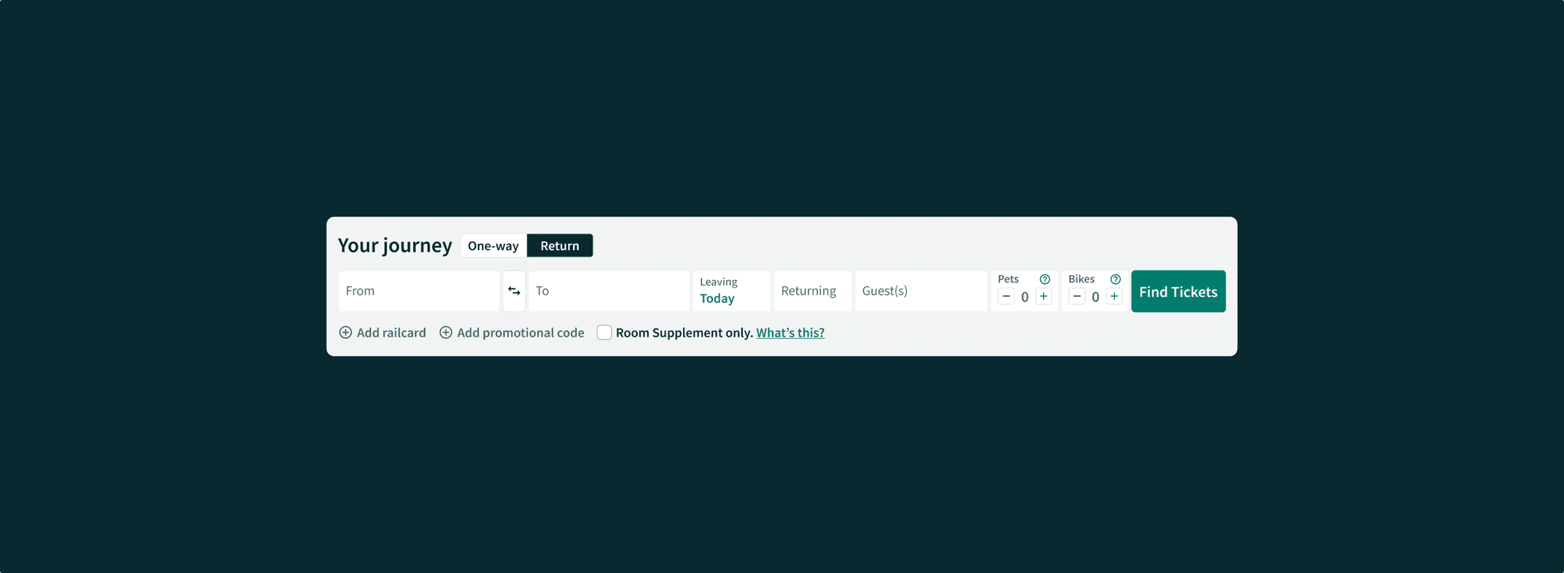
The biggest constraint was the booking engine: Caledonian Sleeper couldn’t change any elements with their provider, so its UX had to stay fixed. I couldn’t remove anything. To make it sit seamlessly in the site I reconstructed it within the CSS and code rather than rebuilding it. That carried into responsiveness: I held the engine’s width steady even at the smallest breakpoints, only switching to a mobile version at the very last one, keeping it accessible throughout. There was also a balance to strike: a narrative flow that excites people before they book, married with the client’s own priority of showing why the experience is so unique. Imagery was part of it too, drawn from Caledonian Sleeper’s own library and, for the Highlands, from stock.
Strategic thinking & planning
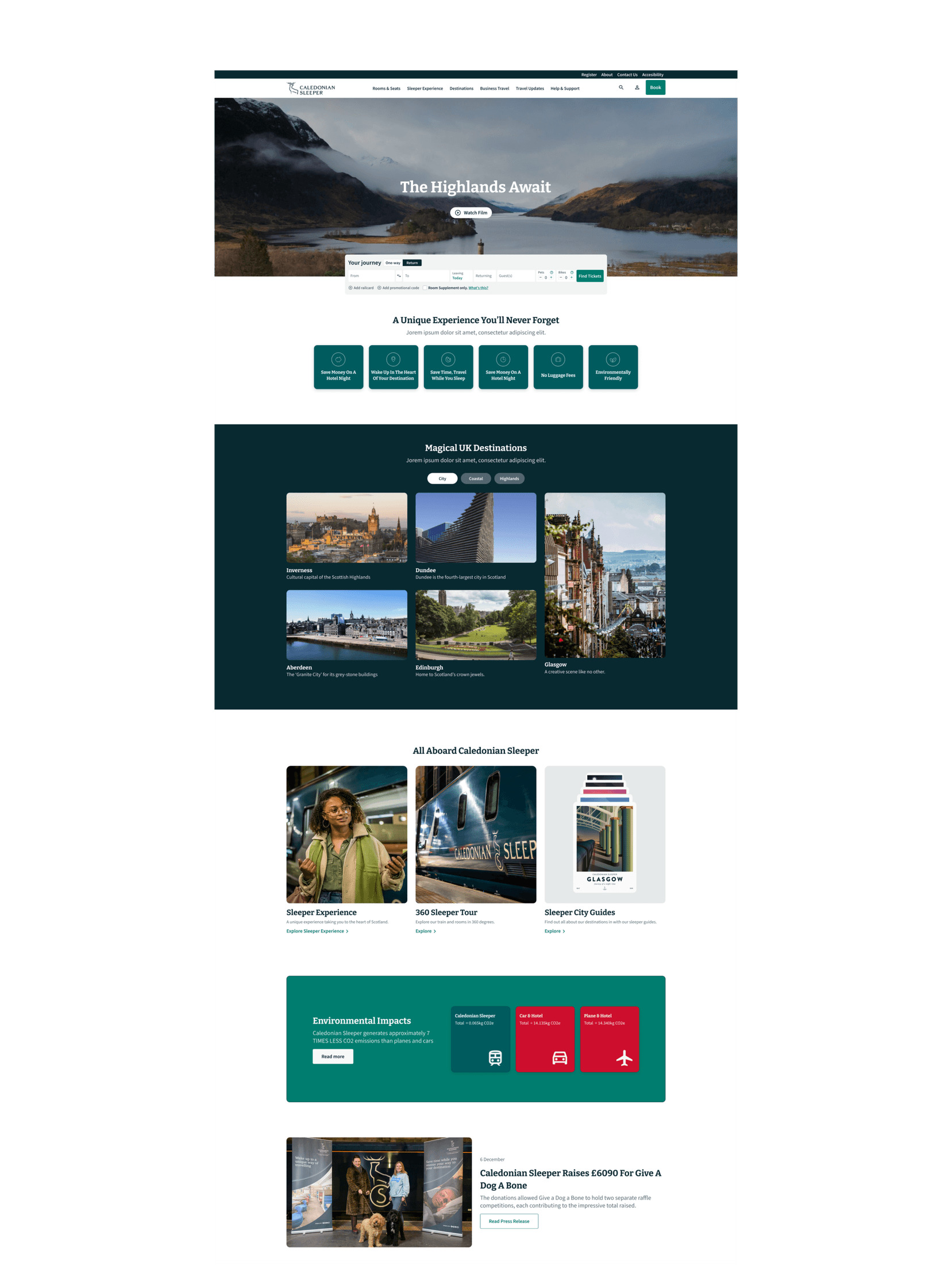
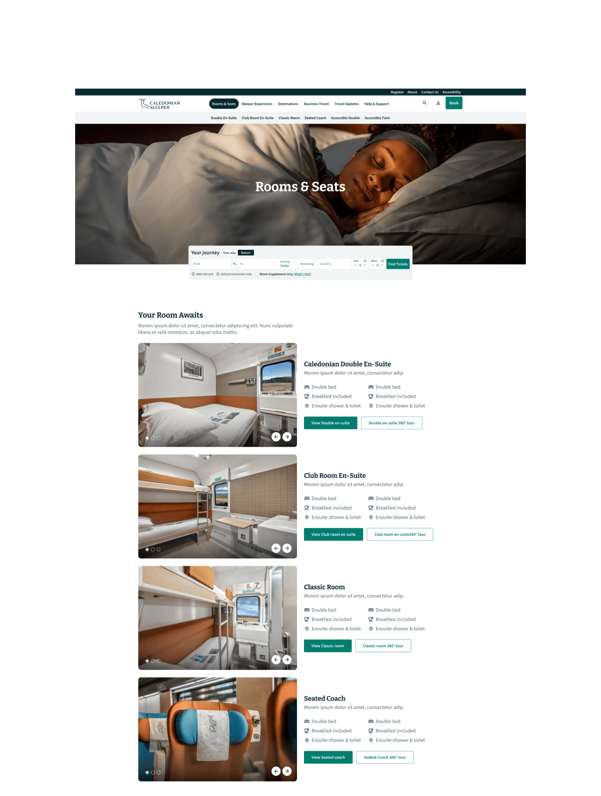
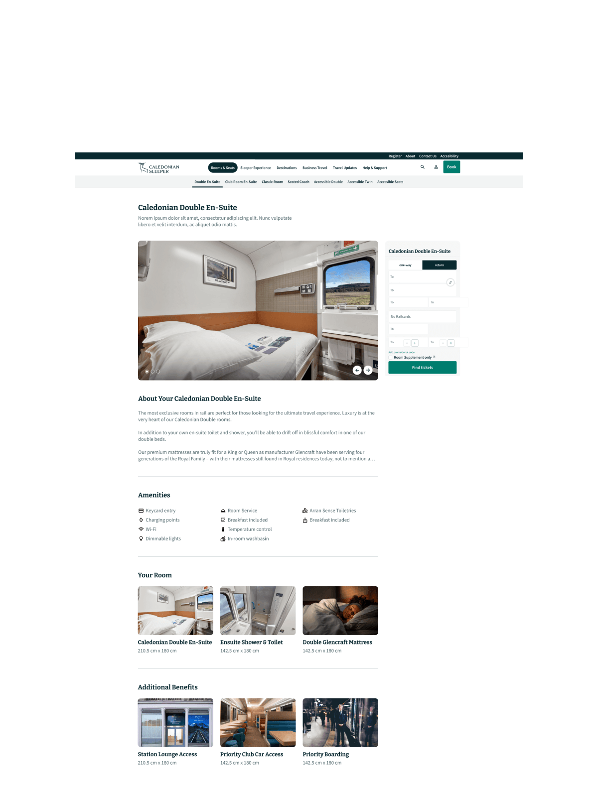
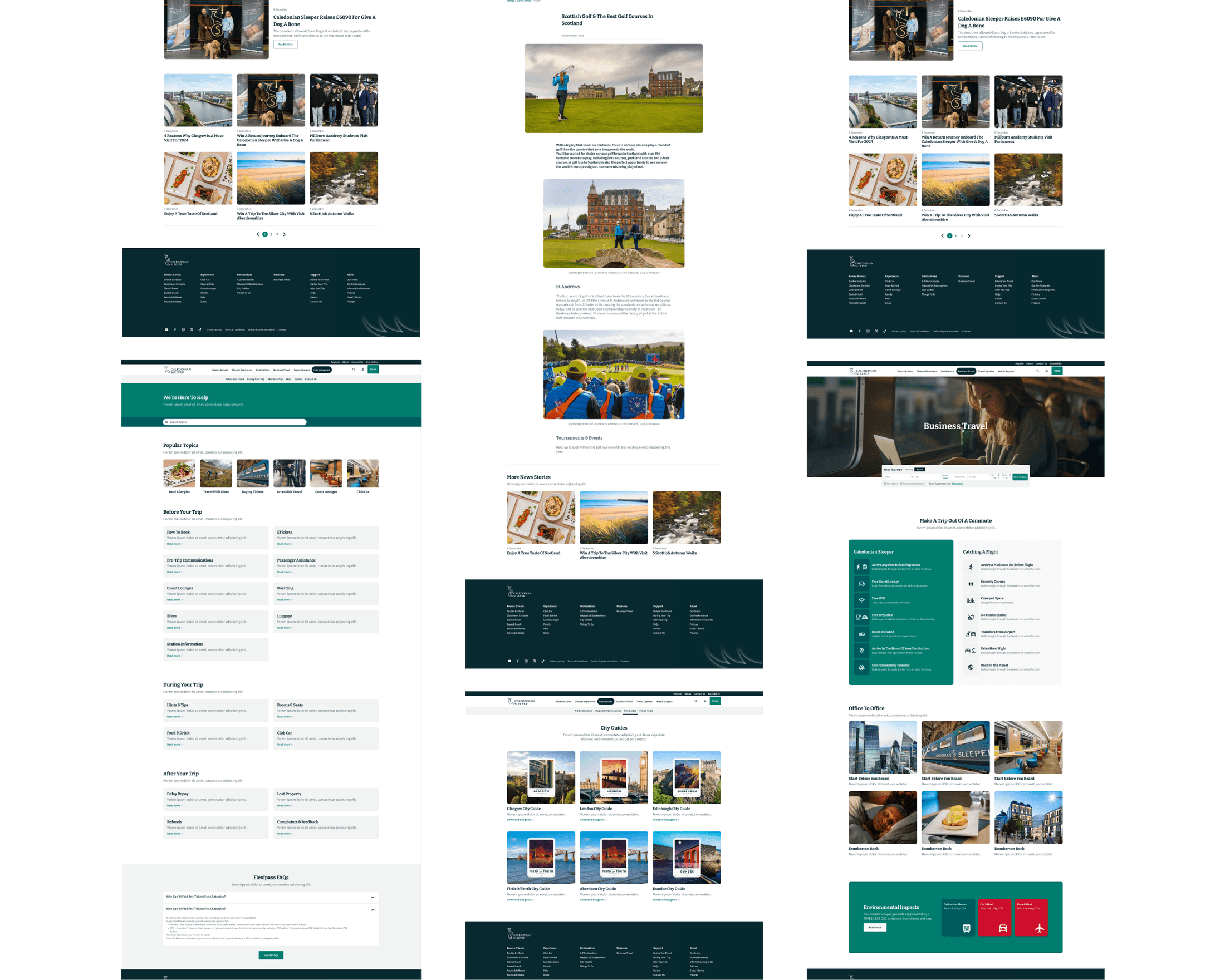
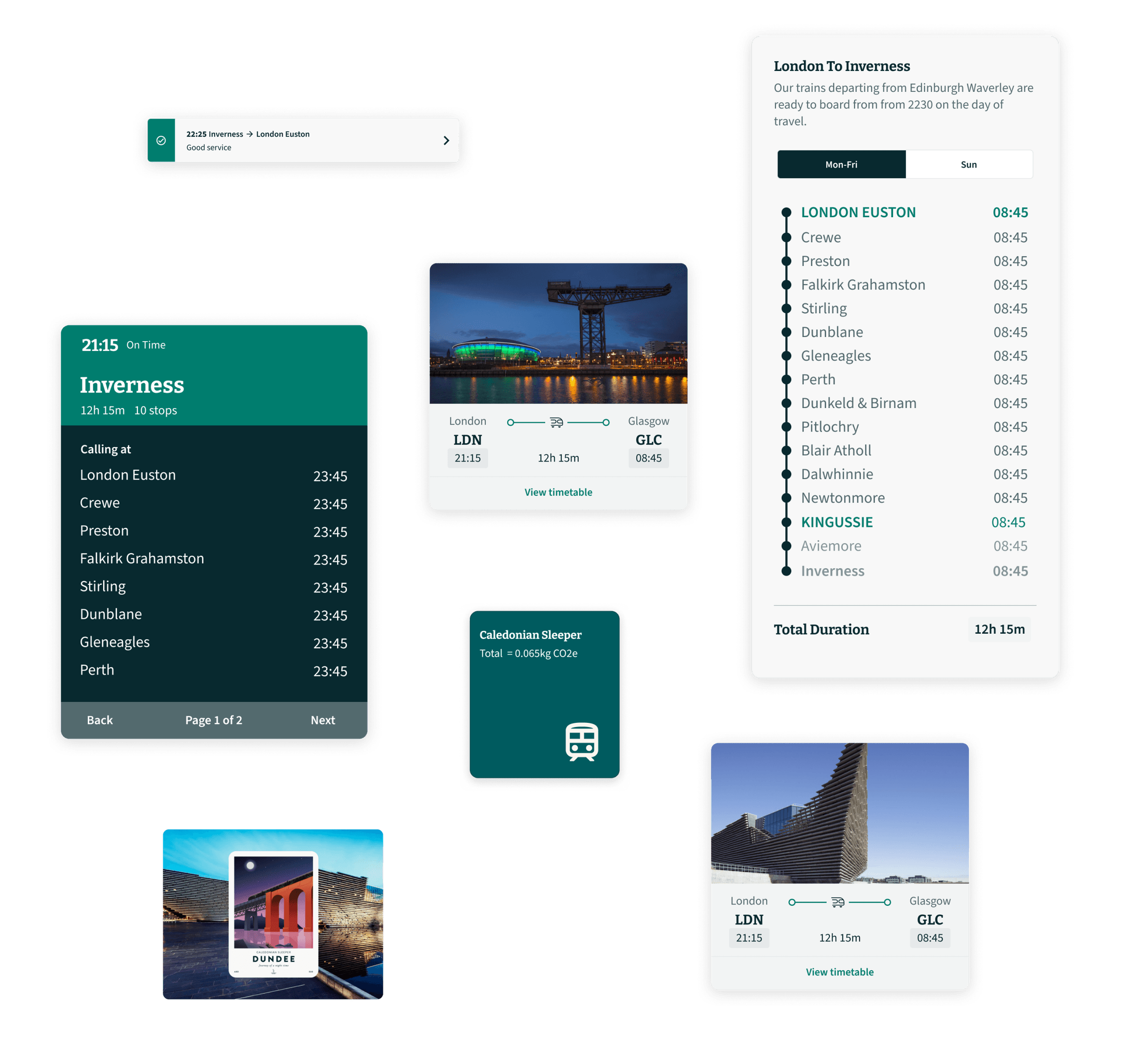
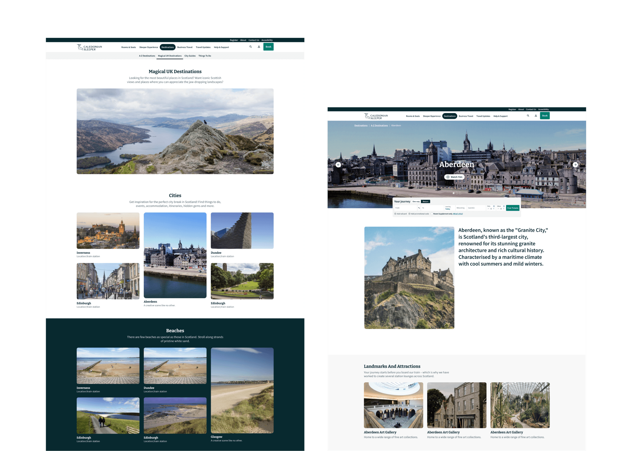
I structured the whole page as a journey: past the hero you meet a set of feature sets, then the magical destinations in a masonry grid, then the Sleeper itself, its environmental impact, and a lead-in to articles. I wanted a one-to-one relationship with the real experience: the on-site timetable was designed to look like the one travellers read at King’s Cross as they board, and destination cards showed journey durations for a quick A-to-B snapshot, much like an aeroplane journey card. The booking engine went horizontal, closer to Airbnb and Booking.com, transitioning to vertical further along the flow, and “your room awaits” leaned into that Airbnb feel around the best images of the train. Navigation had to feel lightweight despite everything it carried: a submenu sits below the main nav while you’re on a page, so you tap through pages the way you would on a phone, a mobile-native pattern the mobile site could adopt straight away.
Outcomes
A complete redesign and overhaul that did what it set out to: an easier-to-read, more digestible site where people keep browsing and discovering while still able to book at any point, with mobile feeling like one cohesive experience alongside desktop. The destination pages were where the client pushed back: I wanted them richer, they wanted them templated so every destination could be driven consistently from the CMS, and we landed there together, which was healthy. A new FAQ section, organised around popular topics and what travellers need before and during their trip and gridded for easy scanning, was designed to divert and better answer common questions. The clients embraced almost everything, and I believe the site is still live and doing well.
 View this project in the interactive portfolio →