Century Capital
Century Capital · 2023 · Property & Legal · via Flipside Group
- RoleDesigner
- OutcomeFirst commercial use of AI-generated architecture (Adobe Firefly)
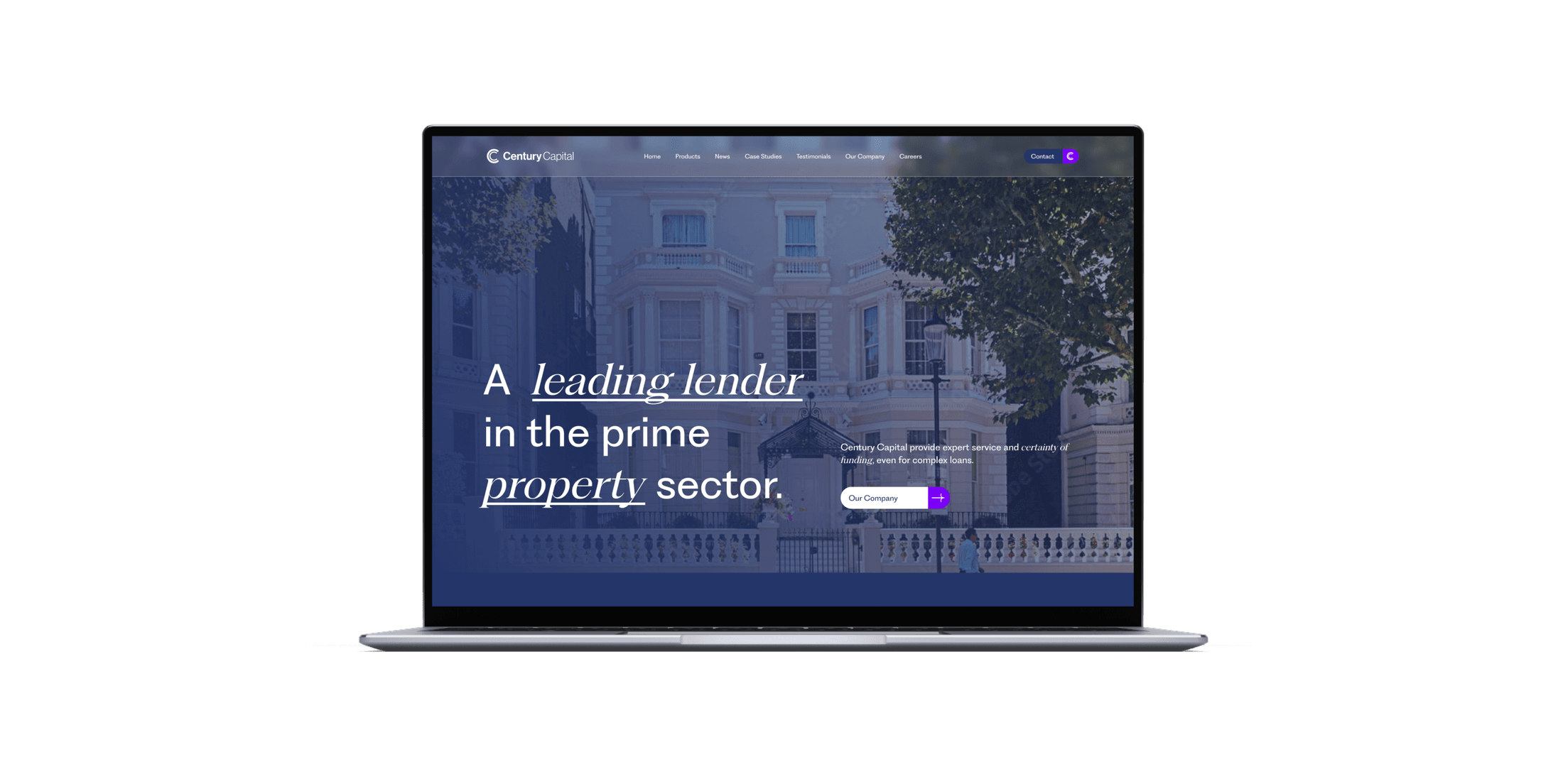
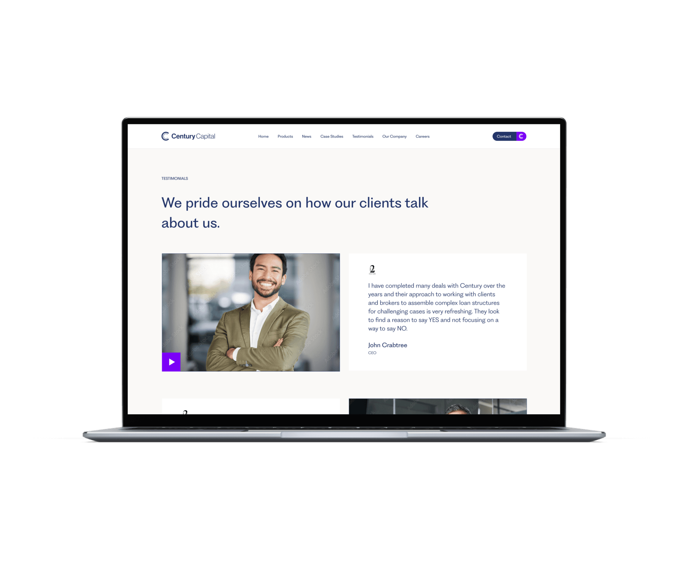
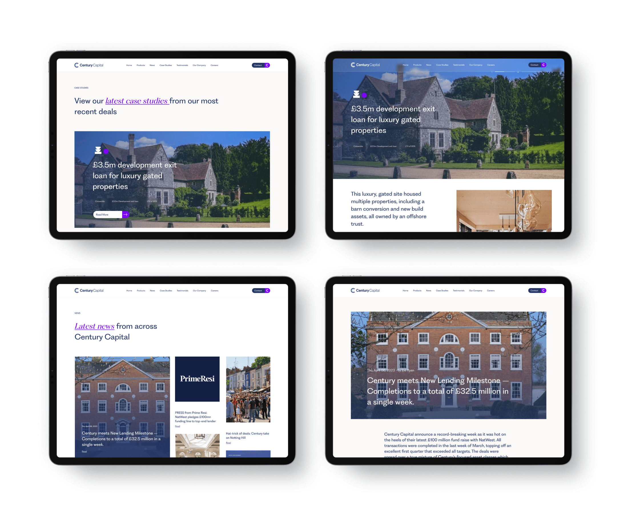
A brand and website reinvention for Century Capital, a leading lender in the prime property sector, pairing a bold new visual language with a refined, sophisticated digital presence.
Introduction
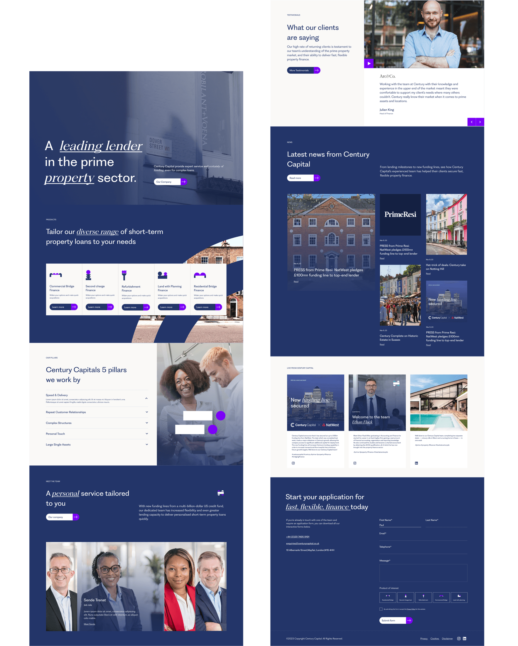
Century Capital, a leading lender in the prime property market, had a really outdated old website and wanted to be brought forward, and I was given a lot of creative freedom to do it. Over roughly four weeks the scope covered everything: I redesigned their logo and visual language and rebuilt the website around it, including all the animation and interaction design. The feedback throughout was light and never game-changing (just small tweaks), which gave me room to be genuinely creative.
Bring a serious, established property lender forward: a new logo and visual language, and a website rebuilt around it, modern and distinctive, but without losing the sense of stability the business depends on.
Challenges overcome
This wasn’t a hard project, but it had a few interesting tensions. The first was how far to push the brand: my logo directions were boundary-pushing, and for a company in a serious financial space the question was how much of that to keep; it went through many iterations to land somewhere fresh without abandoning what already existed. The second was tone: Century Capital deal in weighty things (bridge loans, the sheer weight of capital) and I wanted the brand to feel lighter than the business itself. The third was imagery: not every property they wanted to feature physically existed yet, so I needed a credible way to represent buildings that were only potential opportunities.
Strategic thinking & planning
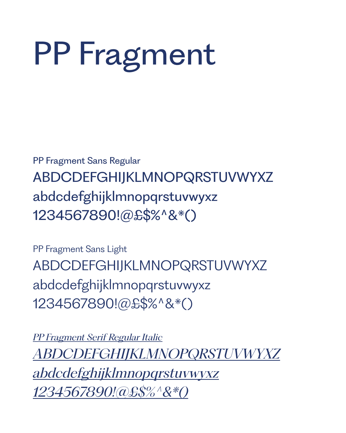
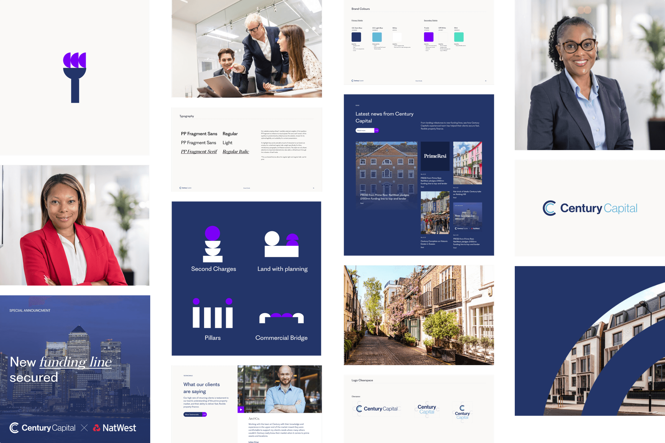
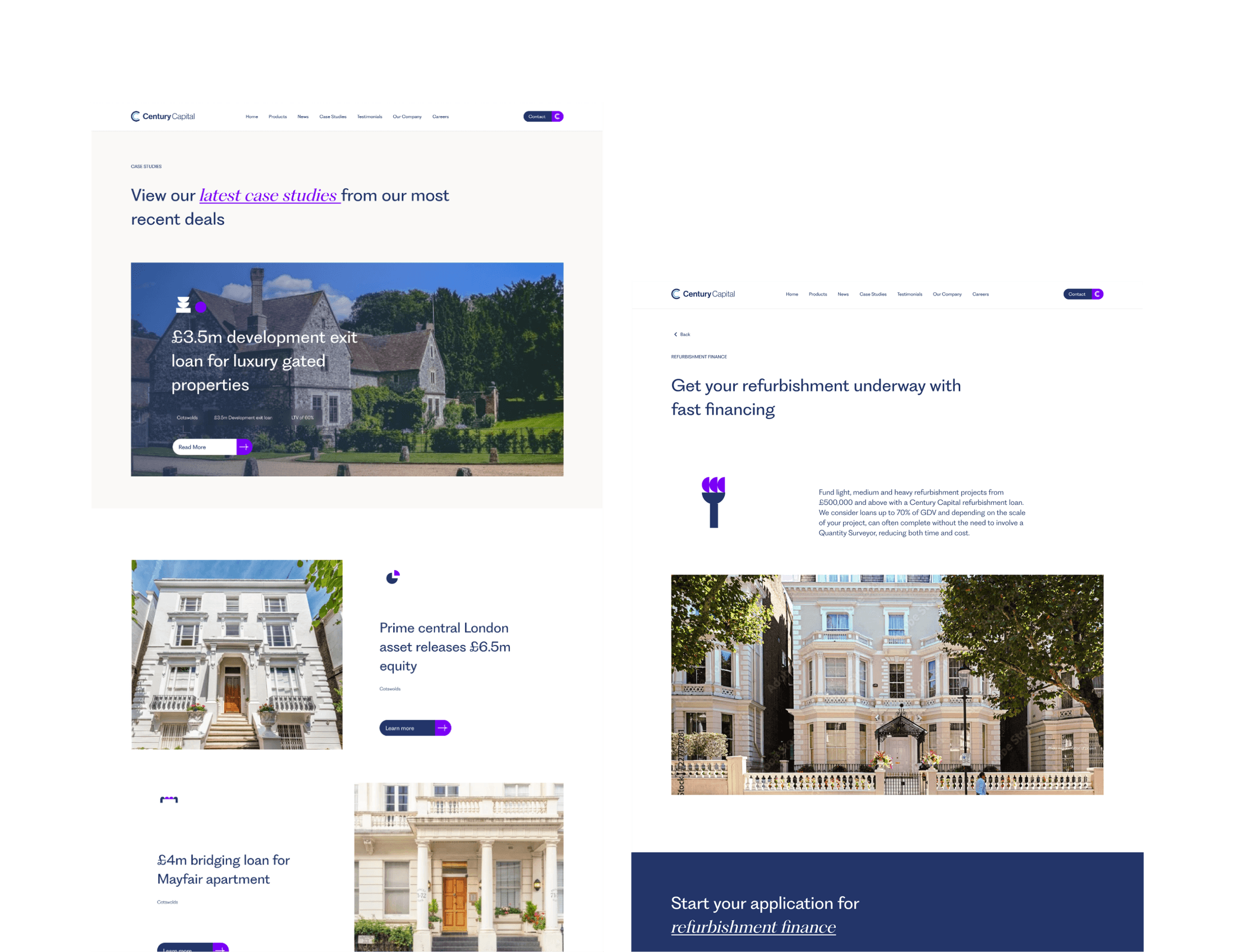
For the logo the guiding principle became evolution, not revolution. To pressure-test my directions I brought in another internal brand designer to explore his own versions and present them back, and we met on a happy medium: tweaking the colours, thinning the inner “C”, and rebalancing the wordmark so “Century” was promoted and “Capital” sat more recessively, deliberately reducing that word’s visual weight so the brand felt lighter despite the scale of what the business does. Around the identity I chose new typography and built a set of animated icons tied to their product lines (pillars, second charges, land with plan, commercial bridge) so users gradually learn the company’s language as they move through the site. This was the first project where I introduced AI: where a building physically existed we used their own photography, and where properties were only potential opportunities I used AI to generate architectural drawings of them, keeping the site consistent and forward-looking without misrepresenting what actually existed. Once the look was signed off, the work moved into interaction design (hover states and the finer detail) ready to hand to the dev team.
Outcomes
The client loved the AI-generated architectural imagery and started applying it across the website. On the brand side, evolution-not-revolution gave everyone something they were happy with, and the lighter, rebalanced logo carried through the whole identity. With the main aspects complete I handed a couple of extra pages to another designer who kept true to the look and feel while I moved on. It was a fun project with a great team, and I think we produced a really nice website, one that pushed the company into a brand-new look and feel for potential clients online.

 View this project in the interactive portfolio →